Designing a Chart of Accounts for Business Central (Not Your Last ERP)
Accountant-friendly and report-friendly are not the same. In Business Central, that distinction matters more than most teams realize.
In almost every Business Central implementation, a familiar conversation happens between discovery workshops and the first design review. It almost always starts the same way.
The controller presents a clean, organized draft Chart of Accounts. The groupings make sense, and the numbering is logical. From an accounting standpoint, it is perfectly reasonable.
But then, inevitably, someone from the reporting side poses a critical question. It might be: “How will we see revenue broken out by region?” Or: “Where will the intercompany eliminations land?” Or, often the showstopper: “How is this structured differently from what we had in the old system?”
More often than not, the answer is: it’s not. The new chart closely resembles the old chart, built for comfort and audit needs intended for the previous platform rather than the new one.
That is the tension at the center of this article. Accountant-friendly and report-friendly designs tug on the same thread, but in opposite directions. Understanding that tension and knowing how to resolve it specifically in Business Central is what separates implementations that age well from those that become expensive maintenance problems.
Two Definitions Worth Getting Clear On
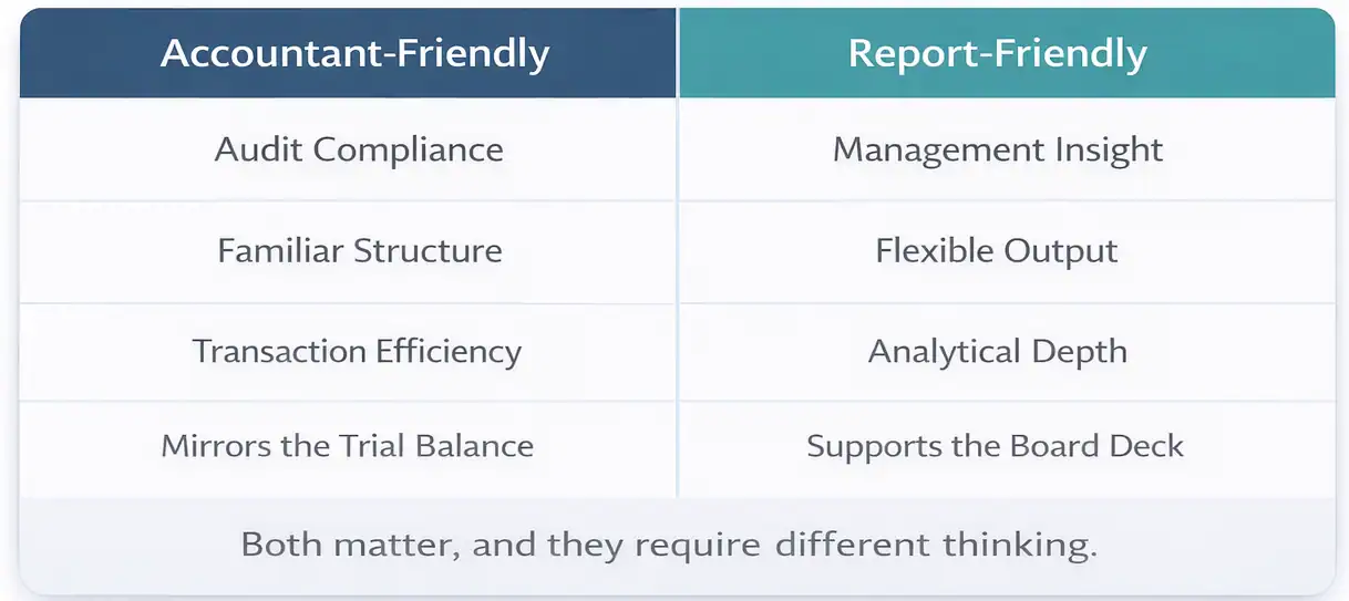
When I say accountant-friendly, I mean a Chart of Accounts designed primarily around how the accounting department works. The structure represents the trial balance. The account groupings follow standard financial statement categories. The numbering convention is familiar. It is easy for the accounting department to post transactions, run the close, and meet audit requirements with minimal friction.
There is nothing wrong with an accountant-friendly design. An accounting team that cannot work its way through the chart efficiently is a real problem.
Report-friendly means something different. It means the chart is designed around the questions the organization needs to answer. Not just the statutory questions, but the management questions. The operational questions. The ones a CFO asks in a board meeting, the ones a department head asks at month-end, and the ones a business analyst asks when building a model.
A report-friendly chart makes those answers accessible without transformation. Without a pivot table. Without an Excel file someone built three years ago, now everyone is afraid to touch it.
The goal is a Chart of Accounts that serves both the accounting team and the reporting audience. In Business Central, that balance is achievable. But it requires intentional design, not inherited structure.

Why Legacy Charts Fail in Business Central
Most organizations migrating to Business Central are coming from somewhere. That somewhere might be an older version of Dynamics, it might be QuickBooks or Sage, or the devil itself, SAP, or it might be a heavily customized system that was never really designed for the business it ended up serving.
Whatever the source, the legacy Chart of Accounts carries assumptions. Assumptions about how accounts roll up. About what level of detail the system can handle versus what needs to happen in a spreadsheet. About the location of the boundaries between what lives in the GL and what lives somewhere else. Those assumptions were for a different platform and don’t always carry over well.
Business Central Is Not a Traditional GL
This is the point that catches some organizations off guard. Business Central is a deeply integrated platform. Purchasing, sales, inventory, projects, manufacturing, and the general ledger are not separate systems communicating through interfaces. They are one system, and the posting behavior is tightly linked to the Chart of Accounts through structures including the General Posting Setup and the posting groups assigned to customers, vendors, and items.
What that means in practice is that the Chart of Accounts isn’t just a reporting artifact. It is part of the posting engine. Account numbers get hit automatically based on transaction types, business posting groups, and product posting groups. If the chart is not designed with that posting behavior in mind, you end up with accounts receiving unexpected transactions, rollups that do not work, and reports that require regular manual corrections.
A Chart of Accounts borrowed from QuickBooks or an older Dynamics version was not designed for this. The integration assumptions are different. The posting architecture is different. Importing it wholesale and hoping it works is one of the more reliable ways to create the kind of permanent reporting tax we described in Part 1.

The Over-Segmentation Trap
Another pattern that frequently shows up in legacy migrations is over-segmentation. The old system required a separate account for every meaningful distinction the business cared about, because it had no other way to capture it. So the chart grew. Revenue by product. Revenue by region. Revenue by sales channel. Revenue by customer type. All of it lived at the account level, because that was the only tool available.
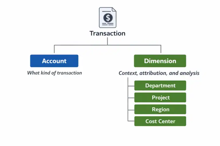
Business Central has Dimensions. And Dimensions change the equation entirely. When over-segmented charts are moved to Business Central unchanged, organizations retain complexity and lose flexibility. The result: hundreds of accounts instead of dozens, a harder setup, and reporting. We’ll examine Dimensions in Part 3. Until then: before finalizing any account, ask if a Dimension could serve the same purpose more simply. Often, it can.
What BC-Specific Design Actually Looks Like
Designing a Chart of Accounts for Business Central is not about following a template. It is about understanding a few principles specific to how the platform works and letting them guide design decisions.
Account Ranges Create Structure
Business Central relies on account number ranges to organize the chart and drive behavior in certain areas of the system. A properly structured chart typically uses a consistent numbering convention that groups accounts logically: assets in one range, liabilities in another, equity, revenue, cost of goods sold, and operating expenses, each in its own clearly defined section.
This is not a mere cosmetic choice. Account ranges affect how Financial Reports are built in Business Central, how totaling accounts work, and how easily a consultant or an internal user is able to navigate the chart when tracing something. A chart with a coherent numbering structure is faster to work with and less prone to posting errors than one where accounts are scattered without a clear pattern.
A common approach in mid-market implementations is a five or six-digit account structure, with the leading digits indicating the category and the remaining digits providing room for meaningful subcategories without over-fragmenting. The exact convention matters less than the consistency of its use.
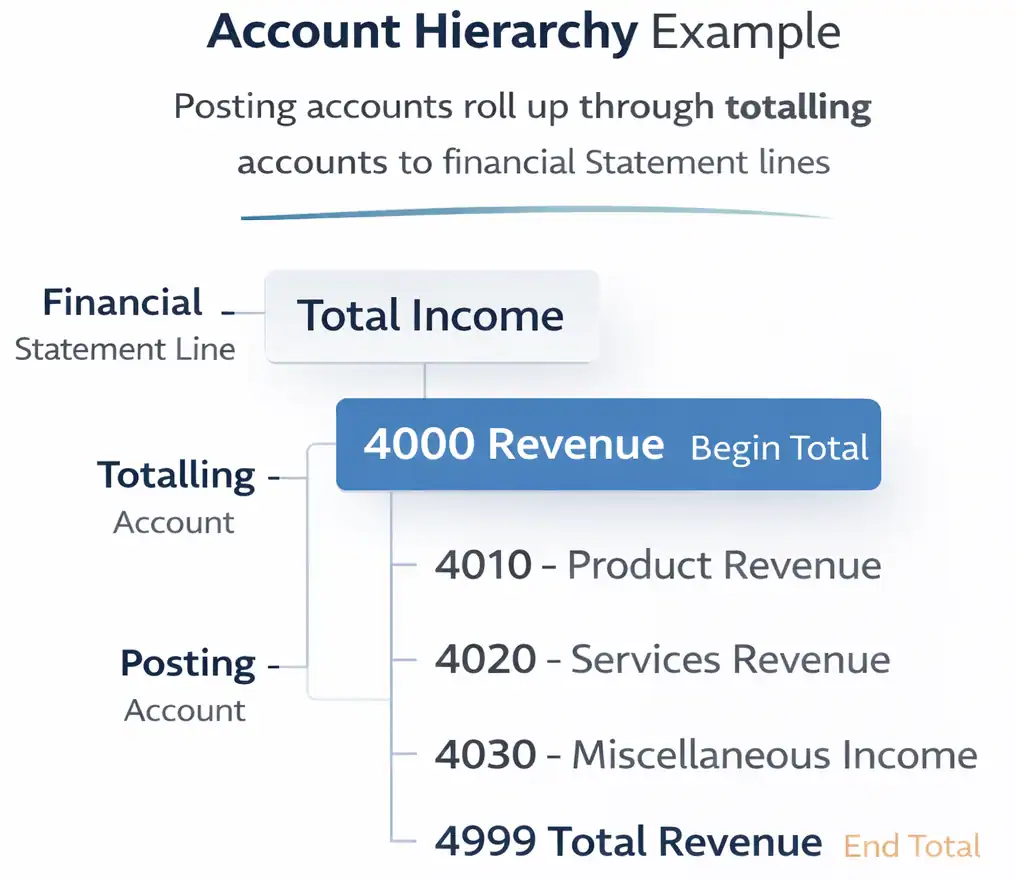
Totaling Accounts Are Underused and Undervalued
Business Central supports totaling accounts, which sum a range of other accounts and appear in the chart as a rollup. They are not posting accounts. Nothing gets posted to them directly. But they are extraordinarily useful for building a chart that is easy to read, easy to report from, and easy to explain to non-accountants.
Most legacy charts do not have totaling accounts, because most legacy systems do not support them in the same way. When organizations migrate without adding them, they lose one of the more practical tools Business Central offers for making a complex chart readable.
A well-designed chart uses totaling accounts to create natural reporting layers. Individual posting accounts roll up to subtotals, subtotals roll up to category totals, and category totals roll up to the financial statement lines. When that hierarchy is in place, building a P&L or a balance sheet in Business Central’s Financial Reports becomes much simpler.
The Financial Reports Layer Is Not a Workaround
Business Central includes a Financial Reports feature (formerly called Account Schedules in earlier versions) that enables organizations to build custom financial statement layouts on top of the Chart of Accounts. This is where the management P&L gets built. Where the department-level views get created. Where the board pack comes from.
Some teams treat Financial Reports as a workaround for a chart that does not quite do what they need. They pile complexity into the report layout to compensate for structural gaps in the chart. That approach works, up to a point. But it creates its own maintenance burden and means the report is doing work the chart should have done.
The better model is a chart that is clean enough to make Financial Reports easy to build and easy to maintain. The chart carries the structure. The Financial Reports layer carries the presentation. When those two things are in balance, reporting in Business Central is genuinely fast and flexible.
The Question Every Design Team Should Start With
Before the first account number is assigned, every implementation team should be able to answer one question clearly: who will use those financial reports, and what decisions will they make with them?
The question is not ‘what reports we need to produce’. Not ‘what does the audit require’? Those questions matter, but they are downstream of the more important ones. The decisions the reports need to support should drive the chart’s structure, not the other way around.
When a CFO needs to see gross margin by product line, that is a chart design question. When a plant manager needs operating expense visibility at the cost center level, that is a chart design question. When an operations team needs to compare actuals to budget by department, that is a chart design question.
If those questions are not on the table when the chart is being designed, the answers will be built into workarounds later. And workarounds, as we have established, compound over time.
Design the chart for the decisions the organization needs to make. Everything else is implementation detail.
A Word on Migration
If you are reading this in the context of an active migration, you may be wondering how much of this is realistic given the time and political pressure that usually surrounds a go-live. The honest answer is: it depends on how much runway you have and how willing the organization is to challenge inherited assumptions.
What is not realistic is a full ground-up redesign with six weeks to go-live and a controller who has been managing the same chart for fifteen years. What is realistic is a targeted cleanup: removing accounts that serve no reporting purpose, consolidating where over-segmentation is obvious, adding the totaling account structure that makes Financial Reports work properly, and flagging the decisions that should be revisited in phase two.
Perfect is not the goal at go-live. A chart that is better than what you started with, designed with reporting in mind rather than inherited by default, is a meaningful achievement. And it is the foundation that makes everything in the rest of this series possible.
Next: The Dimensions question.
Once the Chart of Accounts structure is set, the most consequential design decision remaining is what belongs in the chart versus what belongs in Dimensions. That is where most of the reporting flexibility in Business Central actually lives. And it is where most of the mistakes happen.
Part 3 covers that in detail.
This Series
Part 1: Your Chart of Accounts Is Already Determining Your Financial Reports
Part 2: Designing a Chart of Accounts for Business Central (Not Your Last ERP) [You are here]
Part 3: Dimensions vs Natural Accounts
Part 4: Reporting Requirements You Must Capture Before Finalizing the CoA
Part 5: How the CoA Impacts Budgets, Forecasts, and Analytics
Part 6: Retrofitting a Broken Chart of Accounts