How the Chart of Accounts Impacts Budgets, Forecasts, and Analytics
Picture the scene. An organization has just completed a Business Central implementation. The go-live went reasonably well. Transactions are posting. The close is running. Leadership is excited about the analytics possibilities, and the IT team has stood up a Power BI environment connected to the Business Central data.
Six months later, the Power BI dashboards are beautiful. The colors are right. The layout is polished. The visuals are exactly what the CFO asked for.
And the numbers are wrong.
Not wrong in the sense of a calculation error. Wrong in the sense that the data feeding the dashboards does not reflect how the business actually operates. Revenue is grouped in ways that do not match how leadership thinks about the business. Departmental expenses cannot be isolated cleanly because the dimension data is inconsistent. Budget vs actual comparisons require a manual reconciliation step before anyone trusts them enough to present. The analyst who built the dashboards is spending more time explaining the caveats than discussing the insights.
Power BI is an extraordinary tool. It cannot fix a broken data foundation. Neither can any other analytics platform.
This is not a Power BI problem. It is not a Business Central problem. It is a Chart of Accounts and dimension design problem that has traveled downstream into every analytical tool the organization is using.
That is what this part of my financial reporting series is all about. The determinations made in the design phase do not stay in the general ledger. They propagate forward into budgeting, into forecasting, and into every analytics layer the organization builds on top of the financial data. When the foundation is right, those tools work. When it is not, no amount of dashboard polish makes the underlying problem go away.
Why Power BI Cannot Save a Bad Foundation
Power BI is one of the most capable analytics platforms available, and its linkage with Business Central is genuinely powerful. For organizations that have invested in getting the data structure right, it delivers on its promise. Executives get the information they need. Operational leaders can drill into the details behind the numbers. Finance can produce board-ready reports in a fraction of the time.
But Power BI is a presentation and analysis layer. It transforms and visualizes data. It does not create data that does not exist, and it cannot impose structure on data that was never structured correctly to begin with.
Here is the specific problem. Power BI pulls financial data from Business Central through a set of tables and APIs that reflect what is in the general ledger. The account structure, the dimension values, the posting patterns, and the budget entries all come through exactly as they were entered. If the Chart of Accounts groups revenue in ways that do not map to how the business measures performance, Power BI will faithfully present that misalignment in whatever visual format you prefer. If dimension values are inconsistently populated, Power BI will produce dashboards with gaps, with uncategorized transactions, and with slice-and-dice functionality that works on some data and silently excludes the rest.
Power BI does not fix data problems. It makes them more visible, more polished, and in some cases more dangerous, because a well-designed dashboard gives bad data a credibility it does not deserve.
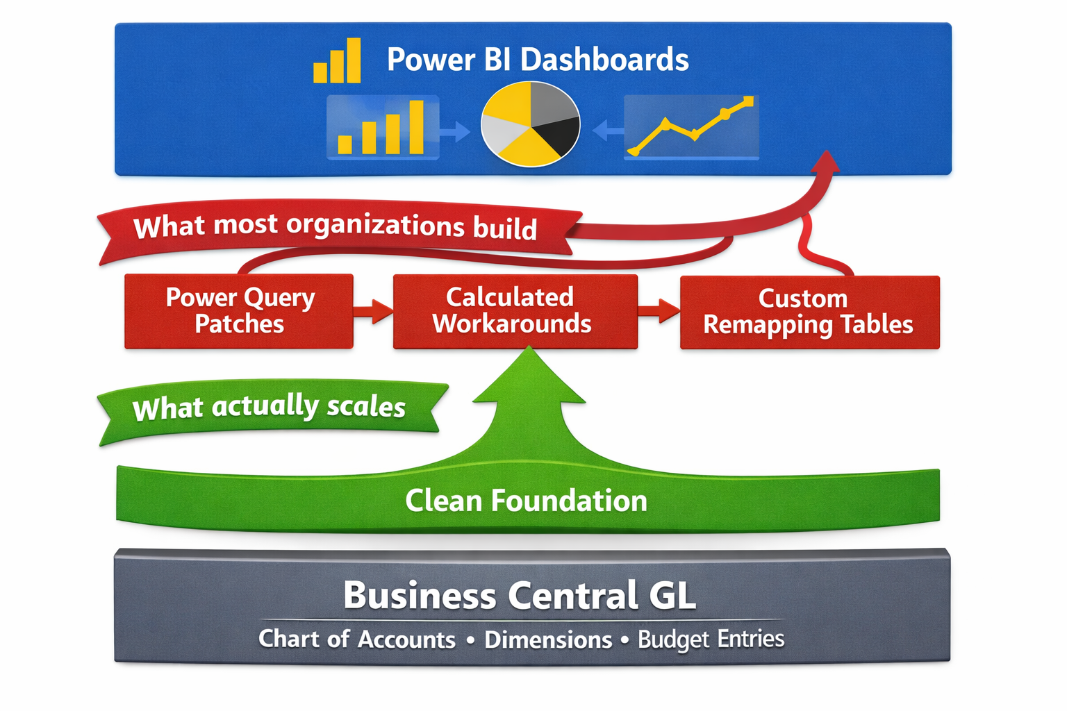
The Transformation Layer Trap
The most common response to this problem is to build a transformation layer. Power Query transformations that rename accounts to match how leadership thinks about them. Calculated measures that compensate for missing dimension data. Custom tables that remap the chart structure into something more useful.
This approach works in the same way that patching a leaking pipe with tape works. It stops the immediate problem. It does not fix the underlying one. And it creates a new level of complexity that someone has to maintain every time the business changes, every time an account is added, and every time the budget structure is updated.
Organizations that go down this path often find themselves in a situation where the Power BI model has become as complex and fragile as the Excel files it was meant to replace. The person who built the transformations becomes the single point of failure for the entire analytics environment. When they leave, or when the business changes, the dashboards break.
The cleaner path is always to fix the foundation. That means addressing the Chart of Accounts structure and the dimension configuration before investing heavily in the analytics layer on top of it. It is more disruptive in the short term and substantially less expensive over any meaningful time horizon.

How the Chart of Accounts Breaks Budgets
Budgeting in Business Central is account-based. Budget entries are posted against GL accounts, and budget vs actual reporting compares those entries to the transactions that have posted to the same accounts. That architecture is simple and powerful when the account structure is clean. When it is not, the budget process becomes one of the most visible and most painful expressions of the underlying design problem.
The Account Mismatch Problem
The most common breakdown pattern in budgets looks like this. The organization builds its annual budget in Excel, as most organizations do, using a structure that reflects how management thinks about the business. Revenue by product line. Expenses by department and category. Headcount by function. The budget is approved, and the financial team is asked to load it into Business Central.
Then comes the translation problem. The budget was built against a management view of the business. The Chart of Accounts displays a different structure, often inherited from a legacy system or designed primarily around compliance rather than management visibility. The accounts do not map cleanly to the budget categories. Some budget lines span multiple accounts. Some accounts have no corresponding budget line. The financial team spends days building a crosswalk that converts the approved budget into something the system can accept.
That crosswalk becomes load-bearing infrastructure. Every month, the budget vs actual reporting runs through it. Every variance explanation requires understanding not just what happened but how the crosswalk translated the baseline budget intent into account-level entries. When new accounts are added mid-year, the crosswalk has to be updated. When the budget structure changes the following year, the crosswalk has to be rebuilt.
None of this would be necessary if the Chart of Accounts had been designed to reflect how the organization measures its monetary performance. The budget structure and the account structure should tell the same story. When they do not, the gap between them becomes permanent maintenance work.
The Dimension Budget Gap
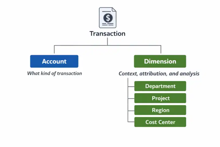
A related problem surfaces when the organization tries to budget at the dimension level. In Business Central, budget entries can carry dimension values, which means it is possible to build a departmental budget, a project budget, or a regional budget that is consistent with the dimension structure used for actuals. When this works, variance analysis at any dimension level is fast, clean, and trustworthy.
When it does not work, it is almost always because the dimension structure was not considered during the budgeting process. The budget was loaded against accounts only, with no dimension values. Actuals are tagged with department and cost center dimensions. Budget vs actual by department shows actuals but no budget, because the two data sets were never aligned at the dimension level.
This is an extraordinarily common problem and an entirely avoidable one. It requires nothing more than a budget load process that replicates the dimension structure used for transaction posting. But it requires that someone made that connection during design, before the budget cycle started, rather than discovering the gap in the first month-end close.

How the Chart of Accounts Creates Forecasting Friction
Forecasting compounds the budget problem. Where a budget is set once and loaded, a rolling forecast is updated continuously. Every update cycle requires the same translation work, the same crosswalk maintenance, the same reconciliation between how the business thinks about its performance and how the system has structured its data.
In organizations with well-designed financial data structures, rolling forecasts in Business Central are achievable and manageable. Finance teams can update projections, reforecast against actuals, and produce forward-looking views without heroic effort. In organizations with structural problems, forecasting almost always migrates entirely to Excel and never comes back.
The Excel Forecast Migration Pattern
The migration pattern is consistent enough that it is worth describing in some detail, because it is recognizable to almost anyone who has worked in a finance function inside a mid-market organization.
It starts with a forecast that is theoretically maintained in the system. But the system’s account structure does not produce the view leadership wants to see, so someone builds a supplemental Excel model that translates the system data into the management view. The Excel model starts as a reporting tool. Over time, it becomes the forecast itself, because it is easier to update the model than to maintain two parallel versions of the numbers.
Within a year or two, the Excel model is the source of truth for forward-looking financial information. The system contains actuals. The model contains everything else. Finance knows which is which. Leadership often does not. And when a new CFO or a new analyst arrives and asks why the forecast lives in a spreadsheet rather than the system the organization spent a significant sum implementing, the answer is a long story about account structures and crosswalks that no one fully enjoys telling.
When forecasting migrates to Excel and does not come back, it is almost never a process problem or a training problem. It is a data structure problem. The system cannot produce what the business needs, so the business works around it.
The Reforecast Cost
The practical cost of forecasting outside the system shows up most sharply at reforecast time. In a well-organized environment, updating a rolling forecast requires adjusting assumptions, updating projections for the remaining periods, and producing a revised view that incorporates the latest actuals. In a poorly structured environment, it means rebuilding the crosswalk to consider any mid-year changes, manually importing actuals from the system into the model, reconciling any differences between what the model expected and what the system recorded, and then reformatting the output for whatever presentation format leadership prefers this quarter.
Finance teams in this situation are not doing financial analysis. They are doing data transformation. The skill set required is closer to data engineering than to the forward-looking financial thinking that actually creates value for the business. And the time cost is real: organizations in this position routinely spend two to three days per month on forecast maintenance that should take a few hours.

The Analytics Readiness Question
Every organization that is investing in Business Central is, at some level, also investing in analytics. Whether that means Power BI, Jet Reports, Continia, a data warehouse, or simply better Financial Reports inside Business Central itself, the expectation is that the system will produce better financial visibility than all that came before it.
Whether that expectation is met depends almost entirely on one thing: whether the data going into the analytics layer is structured to support the questions the analytics layer is being asked to answer.
There is a useful test for this. Before committing to any analytics investment on top of Business Central, ask whether the following are true.
First: Can the system produce a clean profit and loss by department, by cost center, or by whatever the primary accountability structure is, without manual effort? If the answer is no, the dimension structure is not ready for analytics.
Analytics readiness is not about the tool. It is about whether the data underneath the tool is structured to answer the questions the business is actually asking. That is a Chart of Accounts question before it is a technology question.
Second: Does the budget structure match the account and dimension structure in a way that makes budget vs actual reporting automatic rather than manual? If the answer is no, the budget architecture is not ready for analytics.
Third: Are the account descriptions and groupings meaningful to a non-accountant who is trying to understand the business? If the answer is no, the chart is not ready to be the foundation of a management reporting layer.
If any of these tests fail, the right investment is fixing the foundation, not adding another analytics tool on top of it. A second tool with the same data problems produces the same results with a different visual treatment.
What This Means for Implementations Already in Flight
The honest reality is that many of the organizations reading this series are not at the design phase. They are already live. The chart is built. The dimensions are configured. Power BI is connected and producing dashboards that require more maintenance than they should.
For those organizations, the question is not how to start clean. It is about how to make progress from where they are.
The most practical path forward usually involves three things. First, identifying the specific structural gaps that are causing the most downstream pain. Budget vs actual misalignment, forecasting friction, and unreliable dimension data each have different root causes and different remediation paths. Diagnosing which problem is doing the most damage is the right place to start.
Second, separating what can be fixed without a chart restructuring from what cannot. Dimension value cleanup, mandatory dimension rule enforcement, and budget load process improvements can often be made without touching the account structure. They will not solve everything, but they can meaningfully reduce the maintenance burden while a more structural fix is being planned.
Third, building the case for the structural work that does require account changes. That conversation is easier when it is framed not as a technical project but as a business problem with a measurable cost. The time finance spends on data transformation as opposed to analysis is a real cost. The delay in producing a reliable forecast is a real cost. The risk that leadership is making decisions based on numbers that require manual adjustment before they are presentable is a real cost. Those costs justify the investment in fixing the foundation.
Part 6 covers this in depth. It is the part of the series dedicated specifically to organizations that are already living with the consequences of a structure that was not designed for what the business needs it to do.
Next: what to do when the foundation is already broken.
Part 6 is the final piece in this series, and in some ways the most important one for the organizations that need it most. It covers the warning signs of a Chart of Accounts that has become a structural liability, what can realistically be fixed, what cannot, and how to make real progress without a full reimplementation.
This Series
Part 1: Your Chart of Accounts Is Already Determining Your Financial Reports
Part 2: Designing a Chart of Accounts for Business Central (Not Your Last ERP)
Part 3: Dimensions vs Natural Accounts: How to Decide What Goes Where
Part 4: Reporting Requirements You Must Capture Before Finalizing the CoA
Part 5: How the CoA Impacts Budgets, Forecasts, and Analytics [You are here]
Part 6: Retrofitting a Broken Chart of Accounts